Aslan Kudrnofsky
Most successful brands make use of a Brand Style Guide to help define their Corporate Identity (CI). Learn the best way to create a professional style guide for your brand.
What’s the first thing that comes to mind when you see a big, golden “M”? How about five brightly colored, overlapping circles? What brand do you think of when you read the words “Just Do It”?
Unless you’re living in a far flung corner of the globe mostly untouched by Western Civilization, it’s pretty likely that the first things you thought of were McDonald’s, The Olympic Games, and Nike.
Our minds associate these ubiquitous logos, colours and slogans with their brands because they have a strong, uniform CI. That strong identity in turn usually comes from a well thought out concept that is clearly laid out in a brand style guide.
Why do companies need a style guide?
A style guide sets the standard for the appearance of a brand. It’s a reference guide for all those involved in the marketing of the brand to help create a consistent CI across multiple platforms and media. It should cover topics all the way from the purpose and positioning of the brand, it’s mission statement, values and personality to visual elements like logo, color palette, typography and supporting graphics. It’s only through consistency in all of these elements that a uniform CI can be achieved in both content creation and corporate communication. A consistent presence across all channels not only ensures high brand recognition, but also appears authentic, trustworthy and reliable. It makes a brand distinctive and gives it a clear profile. Style guides also ensure continuity in the company: even if employees change, the brand appearance remains uniform.

Source: Logo sketches from the Optus Brand Style Guide
#1 Brand History
WHY?
Sharing your stories will help make a more personal connection with your customers. We all start small and face struggles as we grow – sharing this journey will take your brand away from being just an abstract entity. Keep it honest – authenticity is an important facet in building trust in your brand.
HOW?
In the first chapter of your style guide, share the history of your brand and outline its founding principles. This makes both for an engaging introduction and a good foundation for what’s to follow.
JOBS TO BE DONE
Answer the following questions:- Who was the brand founded by and when?
- What does the brand stand for?
- What’s special about the brand?
- What are the defining features of your brand then and now?
Expert Tip
Make your style guide easy to access! The brand style guide needs to be easily accessible to all employees at all levels (e.g. on a company server or a company wiki). The document should be able to be shared with anyone, especially new employees or creative partners. If there’s currently only a printed version, you should make a digital copy that can be shared online. It’s also a good idea to include contact info for the relevant personnel on your marketing team who can answer any questions related to CI and brand image.
#2 Corporate Philosophy
WHY?
A deeper knowledge of your brand is essential for a successful and complete style guide.
HOW?
Choose 3-5 adjectives that you feel succinctly capture the most important characteristics of your brand. That should help to clearly express your brand’s “personality”. Then try to answer these questions: What does your company stand for? What’s the model the company is built on?
JOBS TO BE DONE
- Mission: Touch on a few brief details about what the brand is currently doing to improve and how it wants to further improve the lives of its customers.
- Vision: What are your long term goals? Where does the brand want to go?
- Values: What are the values your brand stands for?
Here’s where you can also think of setting out a brand promise – set a goal that makes a guarantee of service and quality to your target customer. Your brand should adhere to this in all aspects of the customer experience.

Image credit: Urban Outfitters brand promise, vision and values
#3 The Buyer Persona
WHY?
You need to know who you’re selling to, and all your communication and content should be geared towards that buyer persona. Laying these out in the style guide is key – everyone in the organization needs to know just who they should be getting through to with each piece of design, content marketing, etc.
HOW?
If you’ve already created well-defined buyer personas, you should include your top personas as examples in the brand style guide. If not, now’s the time to do so.
JOBS TO BE DONE
Creating buyer personas shouldn’t be too difficult. A buyer persona is a semi-fictional representation of the real life kind of person who would most likely buy your product or make use of your service. Creating these personas can be best achieved with collaboration of colleagues from multiple departments, e.g. HR, sales, marketing and product development teams. Another useful resource to get you started is Hubspot’s free Buyer Persona Tool. Or come talk to us and we can personally work with you to find your ideal target group and create a buyer persona in a one-on-one content strategy workshop.
#4 Logo
WHY?
Perhaps nothing more immediately represents your brand in the mind of the customer. Your logo serves as your company figurehead and should be as memorable and immediately recognizable as possible.
HOW?
Once you have your logo, you have the basis for all your branding materials, from business cards and packaging to web design. By defining the style, color palette and font for your overall look, your logo is really the starting point for your brand’s style and image.
JOBS TO BE DONE
Make sure to clearly communicate:- What your logo looks like
- What colors can be used
- The minimum size it can appropriately take
- All variations, and where each can be used
- The standard placement and size for each context it’s used in
![]()
Source: Logo guidelines in the NASA Graphic Standards Manual
In addition to the instructions for logo placement, illustrating some “Do’s and Don’ts” can be very helpful. Here are a few examples from the Spotify style guide on how the logo may not be used:
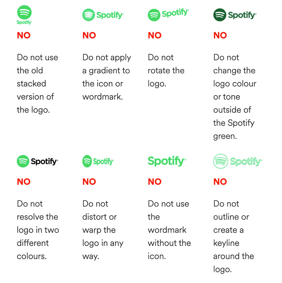
Source: Example from Spotify's branding guidelines
#5 Color Palette
WHY?
Whether it’s the red and white can of Coca Cola or the stark Swedish-flag inspired yellow and gold signage of Ikea, colors often determine the first visual impression the world gets of your company. In fact, color associations can be so important to a brand that many companies trademark certain combinations to prevent competitors within their industry from infringing on their valuable association.
HOW?
Think carefully about which colors suit your values, products and goals – especially within your target group – and in which contexts they should be used. Consider what’s popular in your industry, what makes you stand out from your competitors, or what helps customers put you into context within that industry.
JOBS TO BE DONE
- Differentiate between primary and secondary colors
- List the associated color codes:
- For digital use, enter the RGB colors and the hex values with the diamond symbol
- The CMYK color model applies to the print area, so also include the CMYK color codes for print materials
- Use color converters to easily convert color models
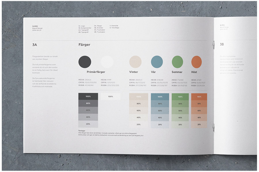
Source: The color palette of NJORD Organic Restaurant
#6 Typography
WHY?
Along with your logo and color palette, specific and distinctive fonts are an important component of your corporate identity and complete a uniform brand image.
HOW?
You might go with one of two approaches here: Either you have only one official font and use it in different variations (font styles), or you have several fonts and use them for different applications. You should, however, try to keep it to no more than two or three fonts. Define your fonts or typefaces in the style guide and discuss where each should be used. A certain font can be used in headings or highlights, for example, and another in the body of the text.
JOBS TO BE DONE
Specify the following:- What font should be used for headings?
- What for should be used for the body of the text?
- What is the correct spacing between the individual letters?
- Which text alignment is used in which situations (e.g. centered, left-justified)?
- Check out this excerpt from New York City Transit Authority Graphics Standards Manual
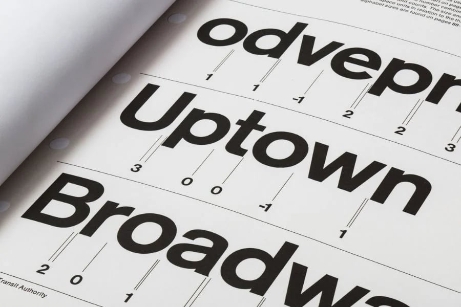
Source: Excerpt from the New York City Transit Authority Graphics Standards Manual
#7 Photos, Graphics and Illustrations
WHY?
The images you present in your communication and marketing will have a major impact on the overall image of your brand.
HOW?
Use your style guide to specify the color, lighting, mood and general motifs that should be used in the creation and presentation of the visual elements in your publications and marketing materials. There will also be certain motifs you’ll want to use for specific topics and categories (eg. People, products, etc). Give a good range of visual examples that you think successfully convey the brand message. If you have icons that are regularly used, specify what they are and where they can be used. Similarly, if you make use of illustrations, provide examples and a style guideline for artists. Make sure to address additional details – it could be the angle of graphics or the rounding of corners in photos – the more specificity you can use, the stronger and more uniform your brand image will be.
JOBS TO BE DONE
Consider:
- How can your brand be reflected visually through the world of images?
- Which qualities should be reflected in the photos used?
- Do you want the imagery to be more emotional, or factual and sober?
Here’s a great example on use of photography from Uber’s style guide:
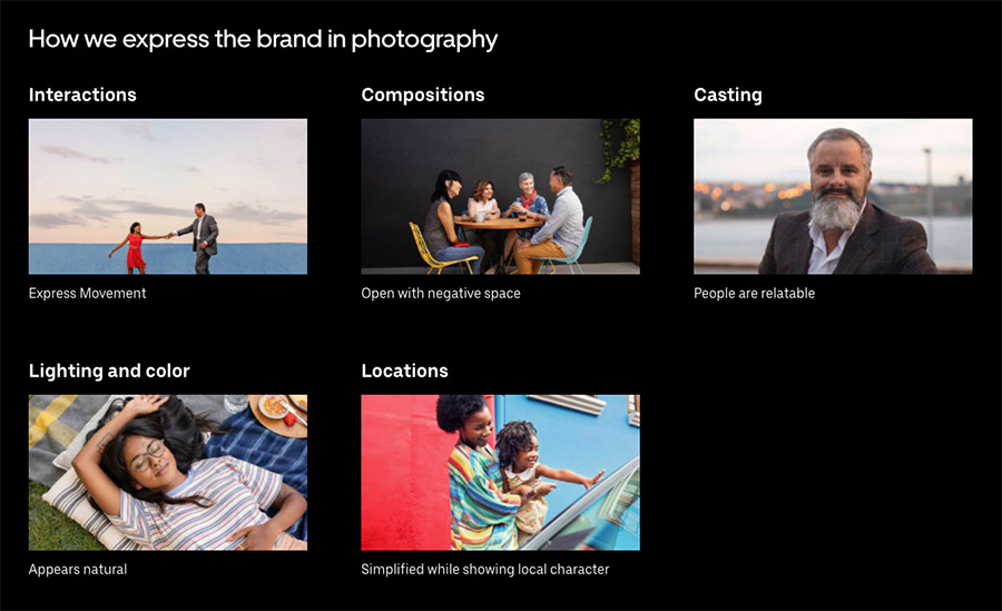
Excerpt from UBER's comprehensive photography guide
#8 Brand Voice and Communication
WHY?
It’s not only the visuals you use that create your brand’s image – it’s also words that you choose. Your company is constantly communicating with customers, employees, partners, suppliers, and more. It’s important to think about the tone of your communication – think of it like the human feeling behind your corporate voice. How your brand “speaks” may change depending on the audience, circumstances and topic at hand, but there should be a general consistency of tone.
HOW?
It’s important to include brand guidelines on language and tone in your style guide in order for your brand’s voice and message to stay consistent. Think about the mood that resonants between the lines, and the character you want people to feel your brand has – and consider as always your buyer personas. Should your message be conveyed lightly and humorously to appeal to a younger crowd, or more direct and supportive to reassure older customers?
JOBS TO BE DONE
- Answer these questions to help define your brand’s voice:
- Is the tone more formal, or casual?
- Is colloquial language allowed?
- Are there certain words that should be used more often?
- Are there other words that should never be used?
- How should the brand name appear when written?
- Are there specific spellings for your products and processes?
- Should proper names, for example, always be written in capital letters?

Source: Skype's branded voice
#9 Best Practice Examples
WHY?
Finally, the best way of for your employees to fully understand and incorporate your brand’s CI into their work will be by seeing clear examples of it in action. If they can use examples as a guide when creating materials, it’ll make the work much easier and the learning process much quicker.
HOW?
Regularly incorporate clear visual and written examples that you feel best display your brand’s image in each section. Add details such as photos of your last exhibition stand, or examples of best practices from your social media channels.
JOBS TO BE DONE:
- What do your email signatures look like?
- How are your business cards and presentations designed?
- How and where do typical advertisements for your brand appear?
Expert Tip
Always keep your style guide up to date.
Your brand is constantly growing and changing, and your brand guidelines should keep up with those changes. You won’t be able to consider every eventuality and style application right from the get go. New social channels or media opportunities may arise, and it’s likely the brand look may need to be refreshed at some point. So really, your brand style guide should always be a work in progress – continuously being updated and further developed. Work with your team and schedule regular content reviews to ensure that the guidelines are being applied appropriately. Have regular conversations about what works and what doesn’t, and ask your team for ideas that will make the brand guidelines easier to use.
Conclusion
A brand style guide is the key to presenting your CI to the world clearly and on your terms. Whether you’re posting on social media, creating brochures, sending out invoices, sending an internal company newsletter or planning a television commercial – with a style guide, everyone involved knows exactly what the result should look like. And the benefit of a style guide extends beyond the here and now: future employees and partners will be able to quickly understand your branding and share your messages to the outside world in a consistent and memorable way.

